Welcome to the New Smith.edu
Change can be hard. We’re excited to have launched Smith’s newly redesigned website with enhanced accessibility, easier navigation, and a refreshed design to match the spirit of Smith—with a sense of community front and center—but recognize that it may take some getting used to.
Refer to this page for information on the new navigation, exactly which accessibility features are being improved, the ways in which the core website content has been rearranged—and where it hasn’t—and exciting new design features.
Get Involved
Dive In
This is just a small sample of the flexibility, creativity, and usability that our new website has to offer. Almost each component is customizable, allowing us to showcase information in a number of ways. Get the scoop on the new organization, navigation, accessibility, and design.
We hope you love the new site as much as we do.
Organization
With a keen eye toward user experience, the new Smith.edu utilizes a new way of organizing information. The new primary navigation items—Discover Smith, Academics, Admission & Aid, Your Campus, and News & Events—together serve a distinct purpose in directing you to the information you’re after. Some will seem familiar, and other items are brand new. Learn about what you can expect to find in each place.
Navigation
The design of the navigation will depend on where you are in the site. With ease of use in mind, we hope the newly redesigned navigation improves user experience sitewide.
Primary Navigation
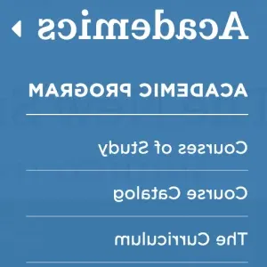
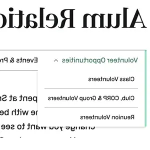
Your top-level—or primary navigation—functions as a simple drop-down menu. Once you’ve landed on a page, it will indicate where you are with a green semicircle.
Secondary Navigation
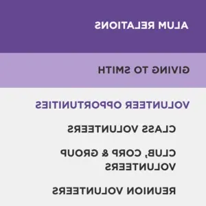
Your secondary navigation—which you can expect to find as you navigate to subpages—differs the most from Smith’s current site. What was once a vertical menu on the right-hand side of a page will now appear horizontally underneath the page’s header or banner image. Drop-down menus continue to function here, to get you into sub-subpages. If a page has enough menu items, you’ll see “MORE” appear on the very right-hand side of the navigation. Use this to scroll to see more items.
Accessibility
Design
The new Smith.edu features a sleek, clean design with occasional bold pops of color. New elements allow us to display information in exciting ways and get to the heart of the content. Check out some highlights.
Infographics
Featuring slight animation upon mouseover, our new infographics display statistics and other information in eye-catching ways.
22,677
files migrated
2,820
primary pages migrated
1,009
profiles migrated
This is just one example of many different quote styles we have to choose from on the new site. Use these to add personalization to your webpages.

Calling Things Out
True to their name, callouts function to get information across to you in a simple and sleek yet effective way. With customizable text, you can use
Headers
- bulleted lists
- numbered lists
and more in callouts.


